Orientation Cycles of the Broye
2022 – Identity & Web Design – Web Development by hemmer.ch
What the client needed
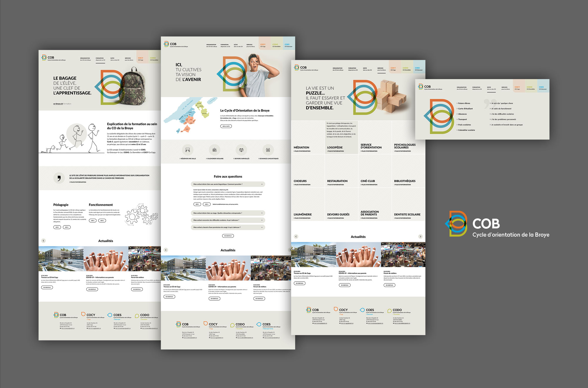
The cycles d’orientation de la Broye decided to renew their visual identity in conjunction with the redesign of their website in TYPO3. The client had suggested to use the Rose crest, representative of the Broye. The identity had to express both the central organization (COB) and the individuality of each of the institutions that form it (COCY, COES, CODO). The identity and the visual of the site had to represent the sensitivities of all the participants, children, parents and educators.
My part of the project
The site is built around the color palette of the logo and a soothing gray-beige base color. The full screen template uses a large Banner Hero on the front page which recalls the visual identity through the gesture of the child’s fingers on his eye. This sign should be used in the future to create a brand image. Quotes on education support the image. The content of the information pages is stick figure type reminiscent of children’s drawings.
The content objects are focused on a simplified user experience with large “Call to Action” sizes and hierarchical content displays.


 Jessica Goodwin